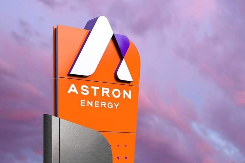
Astron Energy - New Times. New Energy
Written by: Michelle Cave Save to Instapaper
In late 2019, Superunion Africa was given the once-in-a-generation opportunity to reposition and rebrand Southern Africa’s second-largest petroleum retailer, Caltex, to Astron Energy.
This mammoth task included not only the design of an entirely new brand positioning strategy, brand identity, forecourt design, and a plethora of secondary and tertiary elements, but the successful transition of over 850 retail sites across South Africa and Botswana.
The world of petroleum has remained largely stagnant for almost three decades, with most of the market’s “big dog” brands stuck with historical positioning and residual design cues. Designing the new Astron Energy brand gave us the opportunity to create a modern, contemporary petroleum brand that is more in touch with the needs of both everyday people and our corporate and institutional customers.
Identifying ‘stagnation’ as the brand’s enemy, we committed to imbuing all elements of the Astron Energy brand with a fresh, new energy aimed at inspiring and fuelling progress in our fast-changing world.
Unifying around the idea of ‘New times, New energy,’ we envisaged a welcoming, genuine, and optimistic energy brand, endeavouring to simplify and streamline the lives of all their customers, be it a corporate CEO managing teams of vehicles across the country, or a mom dropping her kids off at school in the morning.
Every interaction with the brand had to inspire confidence and a boost of positivity, helping the customer feel more in control of their day and rewarding them with what they value most: more time.
When it came to designing the new visual language, we looked to the seemingly limitless potential of Astron Energy’s customers. If we wanted to create a brand able to keep pace with their busy lives, we had to start with what really matters to them. This meant looking beyond the spaces where petroleum brands traditionally live to the spaces where people live.
We were inspired by the shapes between intersecting roads on complex highways, as these are the spaces where people and communities grow and thrive. These shapes formed the basis of Astron Energy’s vibrant and dynamic new visual identity.
For the brand logo, three simple shapes connect to create a dynamic brand icon, designed to be as iconic from afar as it is up close.
We selected a unique colour palette of orange and purple to bring the brand personality to life. Our Future Energy Orange is warm, welcoming and energetic, while our Deep Space Purple is creative, unconventional and innovative.
In order to capture the energy of not only Astron Energy’s customers but the almost one-thousand employees who bring their energy to the company every day, we created a series of dynamic patterns. Designed to evoke the brand from any angle, at any size, animated or still, these connecting shapes reflect the movement of our people as they flow in and out of our forecourts, offices and refinery.
Superunion Africa is proud to have been given the opportunity to help create a brand that will be a dominant part of Africa’s energy landscape for many decades to come and is excited to be a part of Astron Energy’s continued journey as it strives to become Southern Africa’s most-loved energy partner.
Get new press articles by email
Latest from
- From Grassroots to Greatness - Rainbow’s Tjokkers Rugby Clinic Builds the Next Generation of Boland Rugby Champions
- Rainbow Chicken - Hand in Hand, We Nourish the Nation
- Exam Prep Hacks for Busy Families
- A Cautionary Guide to Mastering Workshop and Rental Management
- Mitch Bowker Officially Steps into CCO Role at Point
- Point Iconic Wins Werksmans Attorneys
- Gear Up - Best Practices for Rental and Workshop Success
- Netstar Unveils Modern Brand Refresh in Celebration of 30th Anniversary
- Xpand IT Acquires Majority Stake in Rapid IT
- Fads And Futures Decode What Really Matters for Brands
- Amazon's Arrival - A Double-Edged Sword for South African Brands
- Iconic Collective Rebrands as Point Iconic
- Hat-Trick Win for Point Iconic at 2024 Smarties
- Key Take-outs from the Hootsuite Social Media Consumer Report 2024
- Point Wins Digital Transformation Award From SABCO
The Pulse Latest Articles
- Education Is The Frontline Of Inequality, Business Must Show Up (December 11, 2025)
- When The Purple Profile Pictures Fade, The Real Work Begins (December 11, 2025)
- Dear Santa, Please Skip The Socks This Year (December 10, 2025)
- Brandtech+ Has 100 Global Creative Roles For South African Talent (December 9, 2025)
- The Woman Behind Bertie: Michelle’s Journey To Cape Town’s Beloved Mobile Café (December 9, 2025)
