The Plascon colour forecast 2018 combining Global trend Inspiration with local insight
Colour influences every aspect of our lives – from fashion and décor to art and design. As South Africa’s largest paint manufacturer, colour is something that Kansai Plascon truly immerses itself in. For decades, the brand has combined the science behind innovative coatings with the inspiration to make understanding and using colour, easy and exciting.
ABOUT THE FORECAST
Every year, Kansai Plascon publishes their viewpoint on the latest colour trends in their Colour Forecast. It starts with the experts in the brand’s Colour Team surveying the way colour is being used across the creative industries, and then filtering this insight into a set of trend stories that truly reflect the global mood. These curate a palette of colours from the Kansai Plascon colour system, brought to life through inspiring room sets and inspiration imagery. With this approach customers can get an insight into the trends at play, supported by the guidance to bringing the looks to life in their own spaces.
THE FORECAST TEAM
The Kansai Plascon Colour Team are responsible for making sure that the brand’s viewpoint on colour is both on-trend and accessible for their customer. They bring the creative complement to Kansai Plascon’s scientifically-advanced and innovative product development and the Plascon Colour Forecast is the company’s way of both inspiring people and showing them how to make that inspiration a reality, be it in an office, home or commercial space, using a combination of creativity and guidance to make the Colour Forecast relatable and so useful. WGSNThis year, the Forecast was conceptualised in partnership with WGSN, a global leader in trend insight. Creatives around the world trust the agency to provide the trend knowledge they need to give their work the competitive edge, making them ideal collaborative partners for the Forecast. At Kansai Plascon value is placed on the global perspective WGSN brings to the project. Combining WGSN’s high-level insight into global creative trends with the Colour Team’s own research and intimate understanding of the South African market, results in the production of something that’s both inspirational and easy for everyone to use.
THE COLOUR STORIES FOR 2018
Overview:The world is in flux at the moment, but with uncertainty comes possibility. As a result we’re seeing a global design scene characterised by creatives playing with eclectic combinations to create something new from the familiar. Taking its cue from this tendency, the stories for this year were all inspired by this mixing of diverse elements. Current colour trends are seeing an experimental spirit in design coming through. Seemingly unusual colour combinations are being brought together, and while not what would be considered a typical colour combination, when you see them together they really do work. This year, the Plascon Colour Forecast Team reiterate that when bold colour choices are on trend, the Forecast is even more important to give customers confidence to explore these in their own homes.
NEUTRAL OF THE YEAR
Along with four themes that express the key trends in the world of colour, Plascon also chooses one colour in the Forecast that captures the overall mood for that year. This year, the team decided to do things differently and pick a Neutral of the Year. This means that the colour is still directional and trend-right, but much easier and versatile for anyone to use, whether it’s by itself or with other hues from the Forecast. The Neutral of the Year for 2018 is Amadeus: an earthy, yellow-tinted hue. The overall feeling in design at the moment is that the world is in flux, and the current colour trends are often about bringing together eclectic influences to create something new. The Colour Team picked this neutral because it balances this tendency out and brings the grounding energy that holds a more diverse palette together.
Colour Story One: Exotic Euphoria
In this first theme, the distinction between natural and artificial blurs in response to scientists and artists hybridising the two in their work. The palette’s supercharged and jungle-inspired brights are almost phosphorescent, especially against the backdrop of lush natural hues. The overall feeling is a little wild and overgrown, and it’s perfect to create living spaces that feel connected and natural but energetic at the same time.
Colour Story Two: Soft Composition
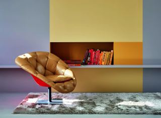
Soft Composition is about editing spaces and styles to create room for contemplation. The mood is calming yet grounded and the whole look is inspired by classic form and colours. The palette gets its on-trend update through the inclusion of bold retro accents alongside the muted colours. In this way classic and contemporary are combined. The whole idea is to create spaces that feel familiar but at the same time look new. It’s a warm take on minimalism for the way we live today.
Colour Story Three: Craft Spirit
Every culture has a craft heritage and this theme is inspired by the way this common past connects us all today. It’s about combining North and South, East and West, and finding that the ties that bind are invariably colour. This rich global mix is expressed in a palette of pigmented hues, fruity accents and watery blues. The overall feeling created in Craft Spirit is one of connection and it’s ideal for creating rich and textured living spaces.
Colour Story Four: Hi-Glo
One for the adventurous, Hi-Glo is the mash-up of digital and physical. It’s inspired by how the digital space allows people to express new identities and at the same time how colour still has such a physical presence in our lives. It’s a rule-breaking palette of citrusy sorbet tones, soft pink, mid-toned primaries and grounding earthy colours to hold it all together. It’s the perfect way to create youthful and more experimental spaces, and lends itself well to artistic colour treatments and paint effects.
WHERE TO FIND IT
Copies of the Forecast are included in leading decor publications around the launch in August, as well as with Plascon’s own Spaces magazine. After the launch, customers can visit their nearest Plascon stockist to collect their own copy. For more information, visit us online at www.plascon.com
ABOUT KANSAI PLASCON
Africa’s Number One Coatings Company, Kansai Plascon, through progressive research and development, scientific expertise and customer focused innovation, provides a beautiful quality range of products that are “Designed for Life” to solve real, everyday customer needs. The latest Plascon Easy Living range brings classic beauty to any home, whilst the trusted names like Double Velvet, Cashmere, Wall and All, Velvaglo, Micatex, and Plascon Kitchens & Bathrooms continue to bring customers inspiration to life using long-lasting, high-performance paint products, no matter what the application.